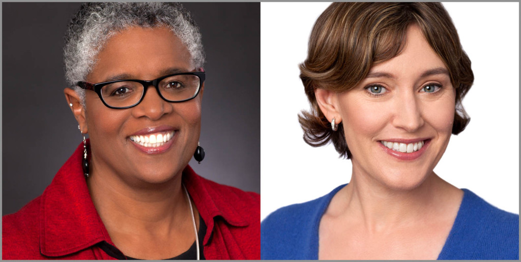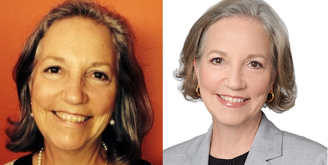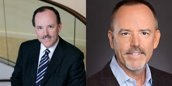
The SRK Headshot Evaluator sizes up your headshot using 5 distinct criteria.These two portraits score a 10.
Welcome to the SRK Headshot Evaluator. Answer these questions about your headshot. You will get an objective evaluation of your headshot based on our experience with thousands of clients and their headshots. We evaluate not only how good you look, but also the effectiveness of your photo on social media and websites, with particular focus on LinkedIn. We are presenting this from a business perspective. Models, actors and other creative fields have more leeway.
We evaluate your headshot on five factors. Each factor is graded on a zero to two point basis, with two being the best score and zero being the worst. If you cannot be objective with your own headshot, send it to us and we will give you a score. Here are the five areas with examples of two point and zero point photos.

It is important to have a professional headshot communicating that you take your career seriously enough to spend your time and resources to get things right. The left shot is a selfie. The right one is a professional headshot.
Professionalism
You should use a professional headshot when you post your profile pic on LinkedIn, your website or any other online business setting. Admittedly this is a very subjective measurement. However, you know whether your shot was done professionally or not. Selfies, crops from group photos, vacation shots, and computer shots are not professional. They tell your audience that you are not meticulous with your image. They may take that as a message that you are not meticulous in other aspects of your professional life. Appropriate amounts of natural retouching are a big plus, as is a professional makeup artist.
2 – You have a photo created by a professional photographer. It is in focus. The lighting is flattering. You have a catch light in both eyes. (A catch light is a reflection spot caused by the studio light used in the photo.) It is lightly retouched.
1 – A good amateur photo with nice light that is in focus and intended as headshot. It is not cut out of some other shot like a wedding, reunion or group photo.
0 – You use selfie, family photo, vacation photo or other non-headshot or the photo is out of focus.
To read about the benefits of a coached photo session from a professional photographer click here.

The before shot on the left is cropped wide making it hard to see his face on a small screen like a smartphone. The photo on the right is cropped to maximize his face in the frame.
Crop
The crop for your photo should fill the frame with your face. This is especially important on social media like LinkedIn. Many people access your profile from a smartphone. Those squares are small, you want to be recognized instantly.
2 – The photo is cropped above sternum, just below shoulders. On top the crop should be just above or into your head. Your face should seem to fill most of the photo.
1- The photo is cropped below sternum, but still well above your waist. Lots of space shows above your head.
0 – The photo is cropped below your waist. A part of another person is in the shot. Ask yourself if you want to click on the picture to enlarge it so you can see the face.
To read more about our cropping philosophy click here.

In the example on the left, a busy background distracts from the headshot. In the professional headshot on the right the dark background is hardly noticed. This photo also shows a great example of a catch light and the difference it makes in a headshot.
Background
Your headshot background should not be distracting. Nor should you blend into the background. Contrast should be evident between your face and what is behind you. Avoid bright colors unless they tie into some creative concept.
2 – Photo uses a white background or other light hues like grey. Solid is best, but outdoor high-key (brighter) backgrounds can work well too. If you use a dark or black background, make sure there are highlights in darker hair to separate it from the background.
1 – The background is somewhat busy or dark but photo is cropped close on a well lit face.
0 – The face and background blend together making it all look like one tone. Or it has a busy background that is distracting and draws the eyes away from your face. Or you have a wide crop with lots of things happening in the background.
To see why we think a white background looks best on LinkedIn click here.

Yours truly pretty much broke every rule on this selfie portrait on the left. (At least the lighting is pretty good.) The main thing here is the distracting wardrobe with printed T-Shirt and Logo Hat. These are two of my favorite garments, but not for a LinkedIn headshot. The shot on the right is my LinkedIn profile pic.
Wardrobe
What wardrobe should you use in your headshot? Keep it simple. Solid colors, grey, medium tones or jewel tones. Ties look great with a symmetrical knot and dimple. Scarves are fine as long as they act as an accent. Blazers work well over lighter color shirts, but a light shirt on a light background or a dark shirt against a flat black background can make the face appear disembodied. On a black background I like to throw a light behind the subject’s shoulders to separate a dark garment from the background. Some combos I like are jewel hues like purple, medium blue (like the photo above) or teal on the white background or red on a black background.
2- You are wearing solid colored garments or small, low-contrast patterns that separate from the background. Clothing is clean, pressed, and professional.
1- Clothing that is professional and in good taste, but does not contrast enough with the background. Distracting elements like a white t-shirt showing from behind a dress shirt. A shirt with curled up collars that should have had collar stays.
0 – A garment with loud, distracting patterns. T-shirts with prints on them. Clothes that draw attention away from your face. Or wrinkled garments that need pressed or repaired. Your glasses are dirty or in bad repair.
To get advice on what to wear for your headshot click here.

The expression in the photo on the left is squinty because of the sun in her face. Look at the relaxed, professional expression in the final image on the right. She leans toward the camera with an engaged expression.
Expression
The right expression in your headshot can really make everything else seem secondary. This is the most subjective of the measurements and ties into your goals and intended audience. Are you in a business that requires a serious expression? Do you want to convey a happy and positive disposition? Make sure the photo you have matches that. But most of all, make sure it looks natural. Engage with the camera by moving toward the lens rather than pulling away as in the example above.
2 – You have a natural expression that looks inviting and engaged.
1 – You have a professional expression but you don’t look engaged or connected.
0 – You look aloof, goofy, squinty or the photo looks like a mugshot or drivers license photo.
Read about getting you expression right for your headshot by clicking here.
Final Total
Now that you have all your scores. Add them up. Your total should be higher to be better. However, if you have a zero in any of the categories, you probably need a new headshot.
8-10 Congrats, you have a nice photo.
5-7 Probably should think about an investment in a new headshot.
0-5 Delete your headshot and use the default silhouette provided by LinkedIn or there social platforms.
If you would like us to evaluate your headshot, email it to us. Tell us your occupation, desired mood and goals for the photo. We will be glad to give an opinion.
If you want to replace your headshot sign up for an appointment at SRK Headshot Day.

